
Public works and engineering are heavily science based, and one goal of mine is to reveal more of the artistry and creativity that goes into public works projects. On a recent trip I picked up a copy of Edward Tufte’s “The Visual Display of Quantitative Information.” The writing is dense but I tore through the book in a weekend as it opened my eyes to thinking of new ways of visualizing data. There are many concepts and principles in the book, but one that has stuck with me is the concept of the data:ink ratio. In short, you should aim for creating a graphic with the least amount of ink necessary.
I decided to try this theory out with a map from work. The graphic below is part of a map that shows the various sources and means for transportation for water in Santa Barbara County. The map also shows the various water disctricts. While this map is has a lot of information that shows where the water is and how it gets to the people who use it, it also contains information that is irrelevant to the subject like mountain topography and highways.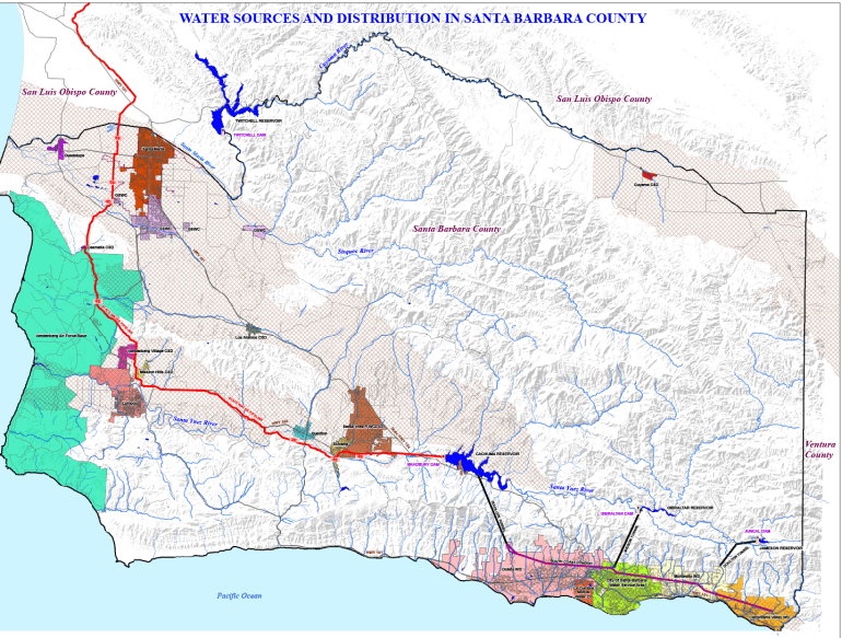
I decided to test out Tufte’s ink:data ratio concept and created a map with only the sources, tunnels, pipes, and water districts. While the creeks and rivers are data that could be included on such a map, I removed them because I felt the ink that it would take to include them was not essential to the data they provide. At this point there is very little water in the creeks and rivers and they were distracting on the map. With this reasoning I should have also dramatically reduced the ink used to create Cachuma Lake (center of the map) and Twitchell Reservoir (upper left of the map) and Gibraltar and Jameson Reservoirs (bottom right of the maps).
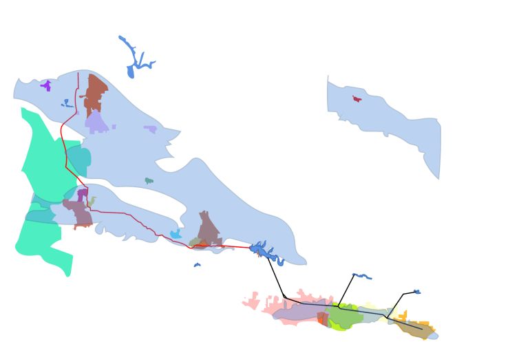
I like the new map for many reasons. If I used this in a presentation it would be much easier to display where water comes from and where it goes. As a stand alone graphic however it needs more text to identify what the reader is looking at. Ultimately I like it as some kind of Alexander Calder/Salvador Dali mashup that represents the process of delivering a vital substance to the public. I posted my art on the Santa Barbara County Public Works social media accounts and asked people to guess what it was and that the answer would be revealed later in the week. One goal in social media and public relations is to grab the reader’s attention so you can present your message. What can happen is that the pretty graphics overshadow the information and the message suffers. My hope is to develop more messaging that is visual and engaging without taking the spotlight away from the facts and the data.

Very cool! I’m slowly working my way through this book. Nice to see your experiment with it!